Commercial centre

Project idea
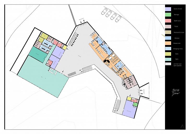
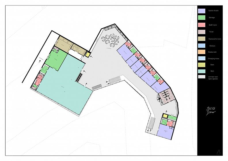
The mass of the mall building in the bay boasts a magnificent location, with its mass oriented towards the sea, offering both breathtaking views of the water and stunning vistas from within. The building leans against the hill at its two extremities, with the service wings nestled in between, held up by sturdy retaining walls. The open corridor between the wings invites you to take a leisurely stroll. The structure is crafted from an eye-catching blend of large glass surfaces, harvest stone, and exposed concrete, creating an aesthetic that is both modern and earthy. With two entrances, located at either end of the building, accessing it is a breeze from any direction. The main entrance showcases character with its charming design, while the side entrance is distinguished by its solid lines. As you walk past the shops, you'll be struck by the feeling of being on a bustling pedestrian street, with the endless expanse of the sea at your feet.
Project description
In designing the massing of the building, my first step was to planthe placement of the stores, including their respective layouts and functions. To optimize the design, I reduced each mass to its minimum volume and then began refining their forms. For me, this involved exploring the relationship between the masses, creating a connection with the surrounding environment, designing traffic flow, and establishing a frontal appearance and corridor layout. Ensuring proper solar exposure between the masses was also a crucial consideration in the design process. To achieve this, I gave the shop's window displays a southern orientation, while the background units, such as the staff room and storage areas, were positioned to the south. To facilitate movement between the masses, I established transportation links by opening up the connecting spaces and corridors. The two levels blend together seamlessly, with the roof opening up to reveal a clear view of the entire building through its glass surfaces. The southern orientation of the building's design allows for breathtaking views of the sea and the adjacent building's wing.
Technical information
Drawing inspiration from the native plants of the national park and surrounding rocky terrain, the building incorporates numerous details that reflect the local ecosystem. The main entrance boasts a striking plasticity that mirrors the rugged relief of the nearby mountains.The expansive glazing captures breathtaking views of the pastel-colored surroundings and people in motion from afar. The elongated shape of the building gracefully merges with the hillside of the bay. The building is constructed with reinforced concrete that meets the ground in the form of a stone retaining wall. Inside, natural materials such as natural plaster are the primary choice, creating a warm and inviting atmosphere.Additionally, the center includes a range of local specialities and unique products, such as those found in the catering, shop, and market. The shop, designed to operate as a marketplace, features individual stalls that sell locally-sourced produce.
Zones
ZONE 4, commercial centre
Documentation
Show PDF 1Show PDF 2Show PDF 3Show PDF 4Show PDF 5Show PDF 6Show PDF 7


