|STU -Bratislava Levitating Glass

Project idea
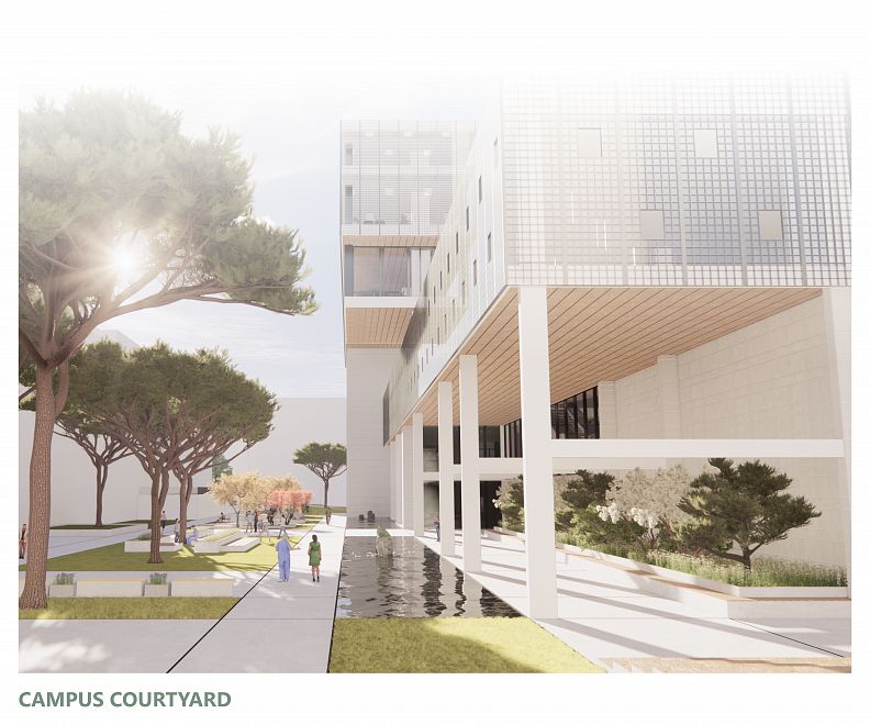
The project offers a rethinking of the joint courtyard space for
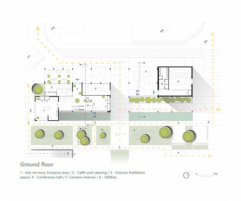
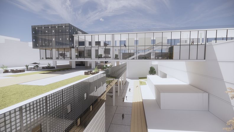
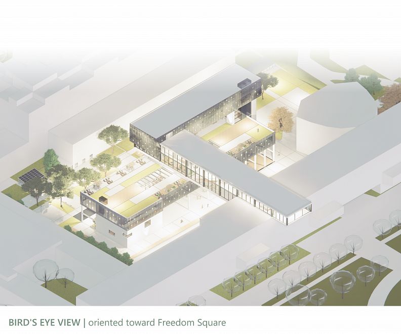
students and city users at the STU campus in Bratislava by designing a spatial structure that incorporates a number of New bridge like masses with the unused laboratory building in the center, alongside the redesign and division of the campus Yard for a number of focal points of occurrence and encounter.
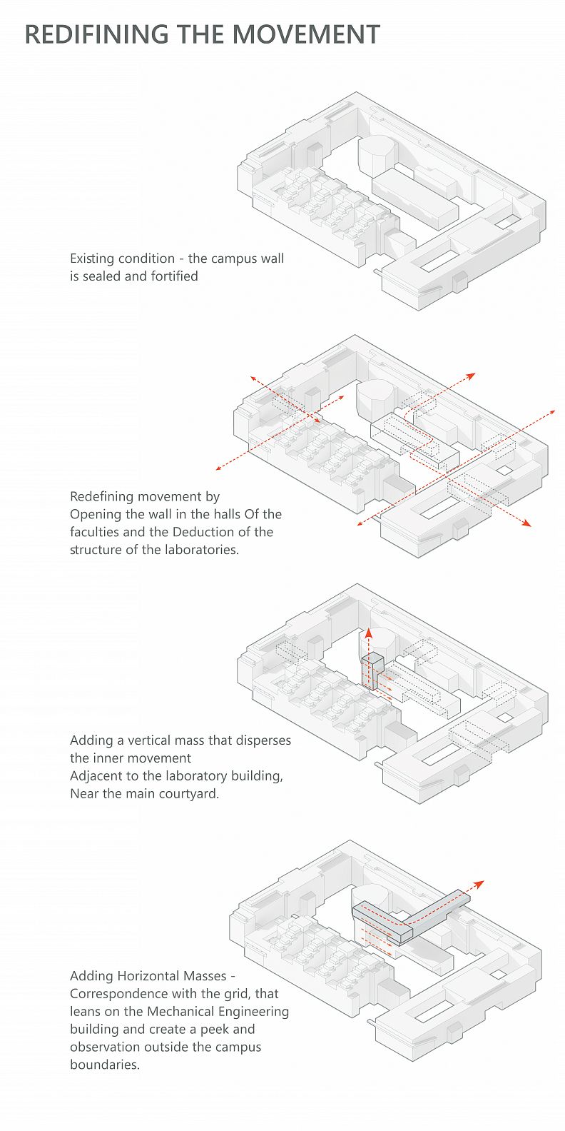
The motivation was to impart new values to the most important academic institution in the country, values of progress, transparency and pride - and to integrate the campus, that currently presents a fortified wall, with the city.
The ambition was to reuse the structure of the heavy machinery as
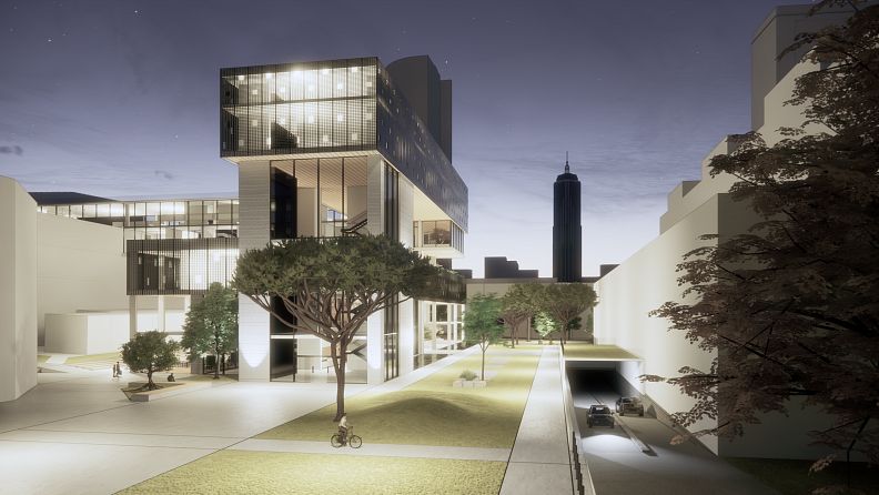
The beating heart of the campus, a place for the faculties students to meet up and have a good time - while partially preserving its characteristics and adding A new structure that is an experience of revelation in the environment, an experience of Exposure and a showcase - one that hints the academic work and attracts movement from the city to the campus - a monument that will be observed from the historic axis that separates the Freedom Square from the STU campus and connects all parts of the inner courtyard to the city.
Project description
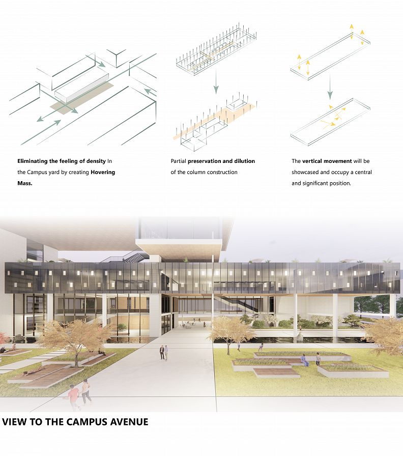
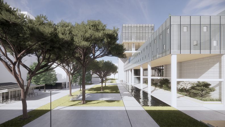
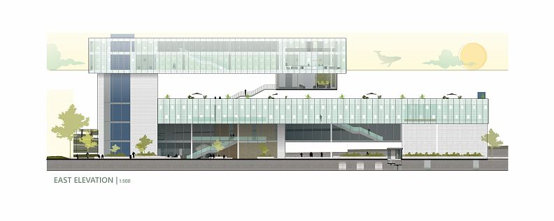
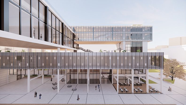
The architectural action redefines the movement in the space, by subtracting from the structure of the laboratories and as a result also creating a feeling of heavy floating Mass on the top floor of the building as part of the overall concept.
In creating the overall mass, the intention was to take into account the existing density on campus - to touch a minimum surface area, to design elements that produce an experience of levitation, transparency and lightness, as well as to re-plan the courtyard, which is currently used for parking, for the university experience.
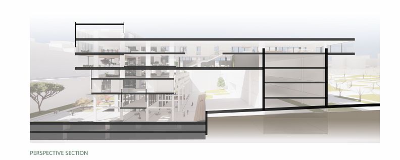
Out of the motivation to connect the city floor to the university's movement system on the one hand and preserve the blocking laboratory building on the other hand I created a gap in the body of the building underneath it that includes planning content of display spaces, and leisure appropriate to urban life.
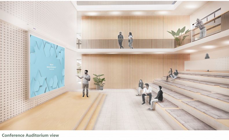
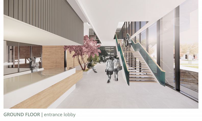
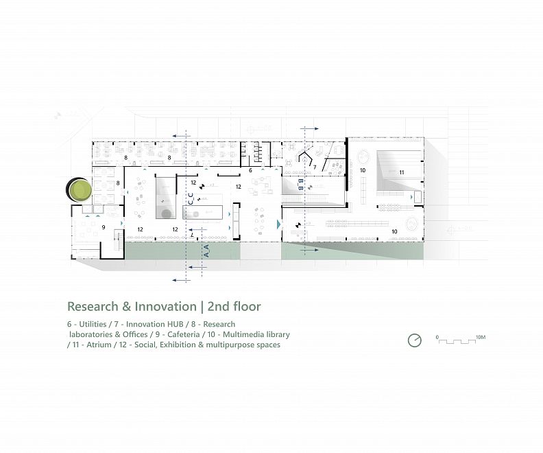
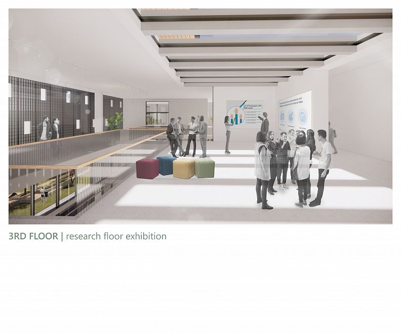
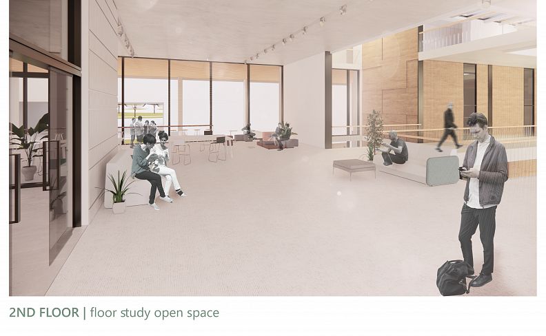
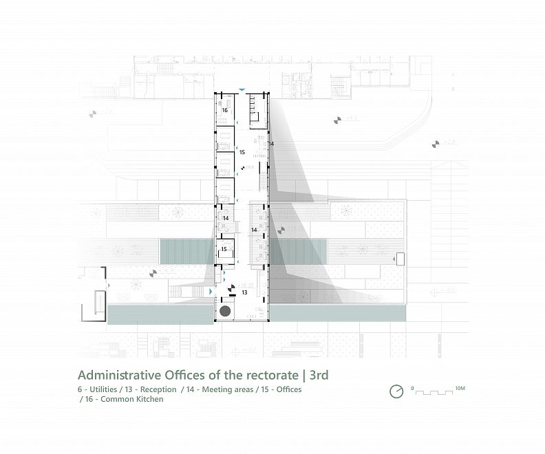
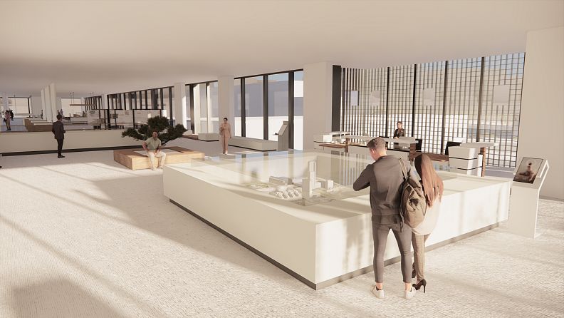
The interior design accompanies the campus grid as well as the development of the area, similarly to the geometry of the new masses, it also holds a longitudinal experience on all floors of the building, of searching and wandering alongside large atriums and open work and leisure spaces that provide a constant glimpse into student life.
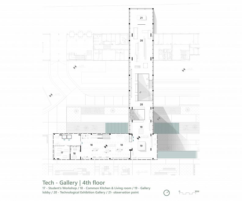
The experience reaches to its peak at the lookout to Freedom Square on the edge of the gallery 4th floor and produces curiosity in the encounter with the city.
Technical information
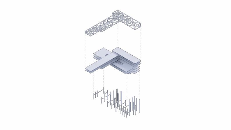
As for the technical aspect there was a challange dealling with the large 30 meter openings that I dealt with and I made it happen with an X trusses in the floors filling and extrusion of the laboratories building collumns higher to prevent from the structural elements to be seen by the eye(shown in a diagram) and keep the longtitunal volumes as minimalist as possiable.
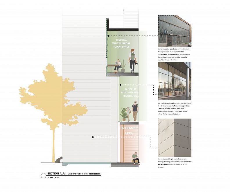
Dealing with the Laboratories building also gave some hard times because it is a relatively old building and it needed a very strict attention as for the collumns dihlution and facade preservation.
There was a Full and special attention to the development of the landscape according to the parking issue requested and a real affort to be as considirating as possiable to the old existing laboratories building's harritage and preservation.
There was real attention to the students and staff's needs and a realy challanging project.
thank u 4 the opportunity :)

