Center of Innovation in Bratislava. Transformation of the courtyard

Project idea
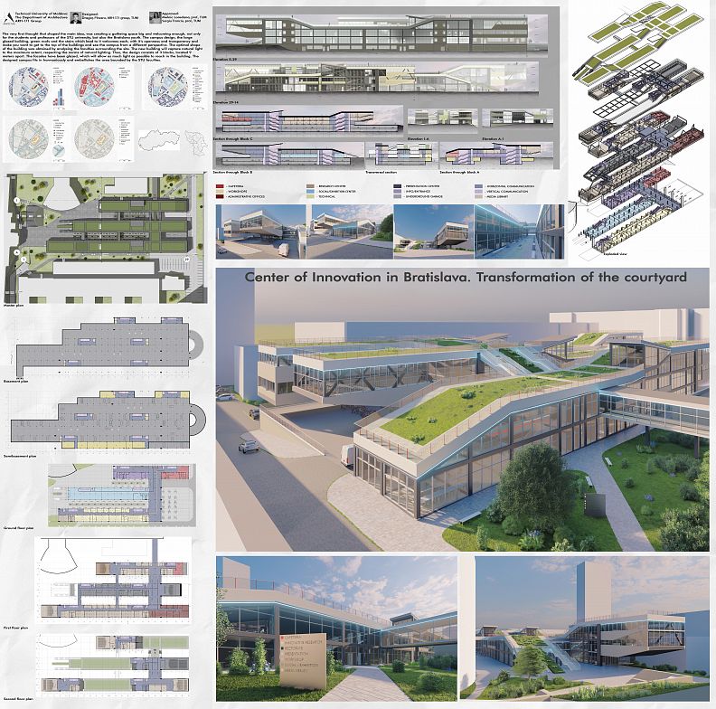
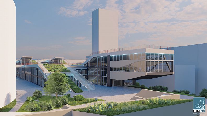
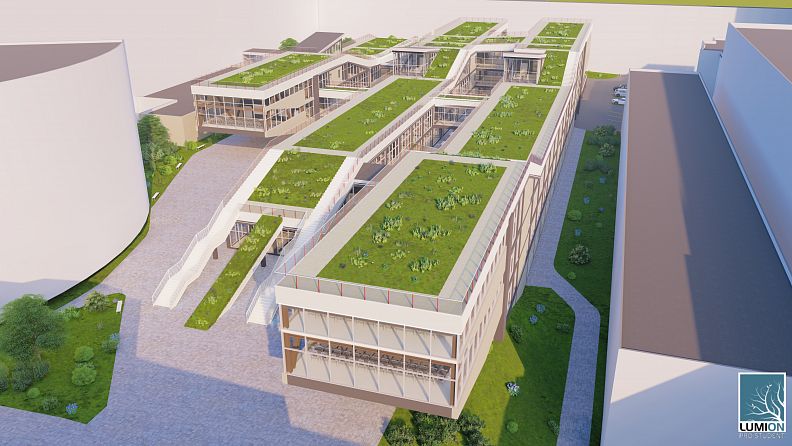
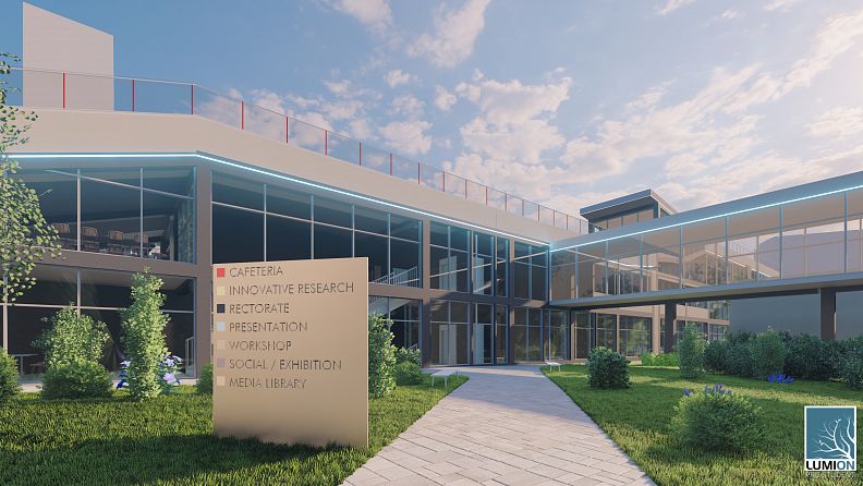
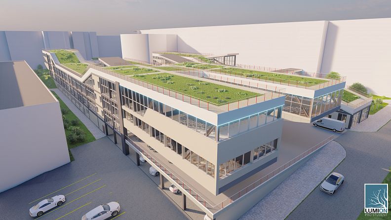
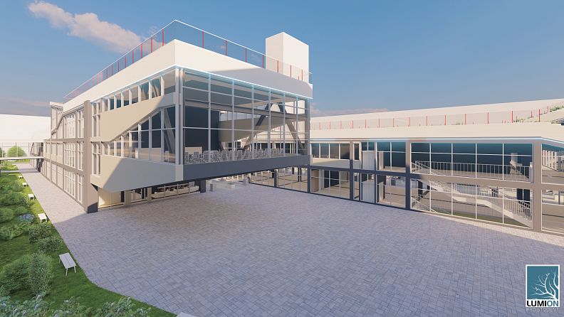
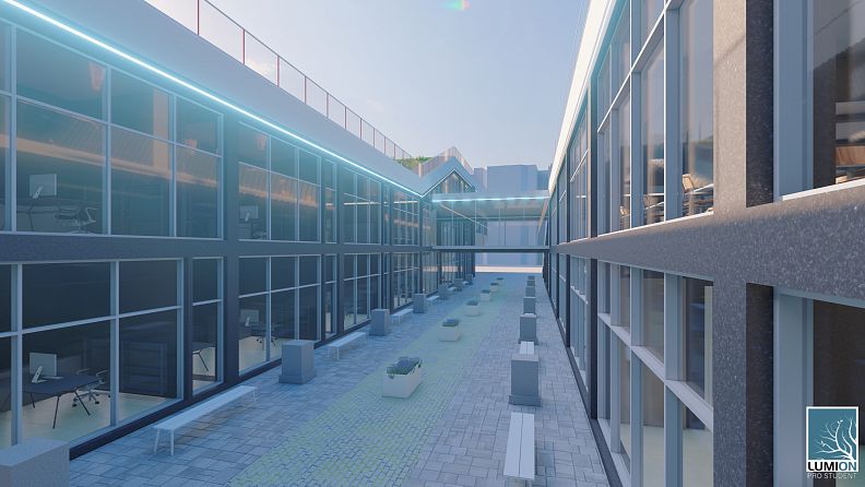
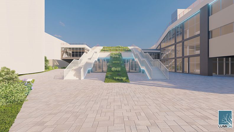
The very first thought that shaped the main idea, was creating a gatheing space big and welcoming enough, not only for the students and professors of the STU university, but also the Bratislava youth. The campus design, the large glazed building, green roofs and the stairs which lead to it welcomes each, with it’s openness and transparency and make you want to get to the top of the buildings and see the campus from a different perspective. The optimal shape of the building was obtained by analysing the faculties surrounding the site. The new building will capture natural light to the maximum extent, respecting the norms of natural lighting. Thus, the design consists of 3 blocks, located 9 meters apart. The facades have been glazed, which will allow as much light as possible to reach in the building. The designed campus fits in harmoniously and embellishes the area bounded by the STU faculties.
Project description
The designed campus of the Slovak Technical University in Bratislava is located in the centre of Bratislava, Stare Mesto sector, between Radlinského, Dobrovsheko and Namestie Svobody streets. Nearby, there are plenty of public buildings, some of them representing the heritage of the city. Thus, when developing the project, it is necessary to respect the area where the campus is located, at the same time, it has to be modern, functional and relevant. The given site has an area of 18500 m2. At the moment, in the place of construction there are: a chemical laboratory, parking lots and several garages used by the university. The area reserved for the new construction is surrounded by the faculties of the university.
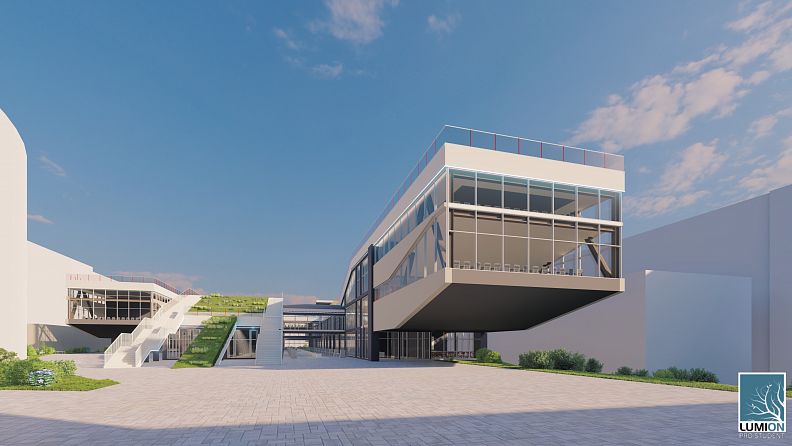
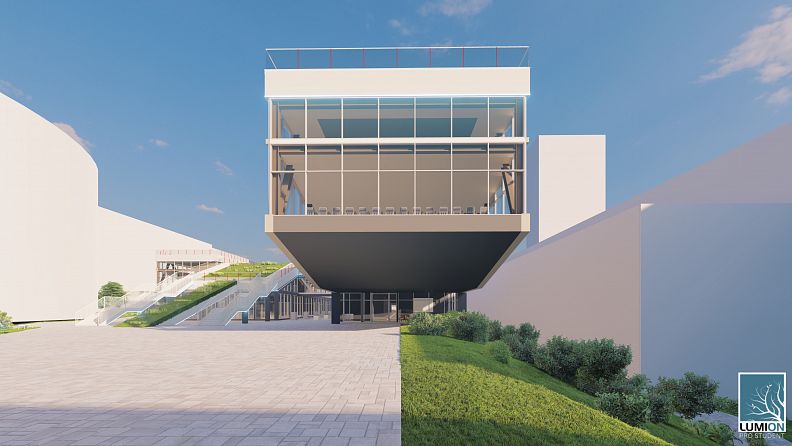
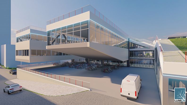
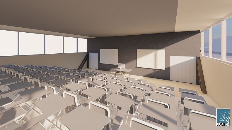
The social area was located on the ground floor of block B, surrounded by outdoor exhibition spaces. The outdoor exhibition area is placed between the blocks. Thus, the visitors will be able to see at any time the ongoing events both inside the building and outside of it. The workshop area was located on the ground floor, in block C. Because the laboratories do not require direct lighting, they were located in the most unfavorable place from this point of view. Next to the main entrance, in block A, are located the rooms of the entrance group (wardrobe, lobby, reception, security, etc.) and the cafe. It is "extended" on two levels, to serve visitors to the exhibition area and a media library. Respectively, in block A on the 1st and 2nd floor is the media library itself. Above the exhibition space is the presentation center, with an auditorium with a capacity of 260 people in the console. In block C, the rectory is located in the console in the northeast. The research center of STU is placed on the 2nd and 3rd floor of block C, with 3 auditoriums located at the ends of the block. The parking lots and technical rooms are located in the underground and semi-basement levels. The access to the underground car park is from the basement level (-7,200 mm), in the southern part of the building. At the ends of the blocks, there are located in the console the halls and the administrative offices of the rectory. Under the consoles there are secondary entrances in blocks, equipped with elevators for people with disabilities. The blocks are connected to each other by walkways and stairs.
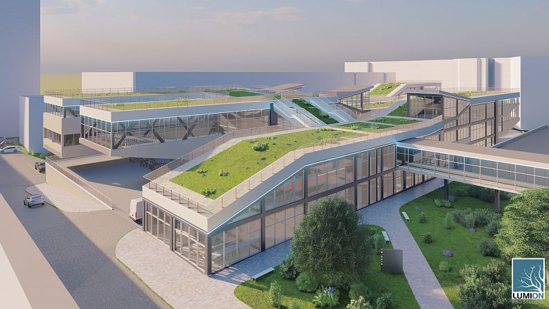
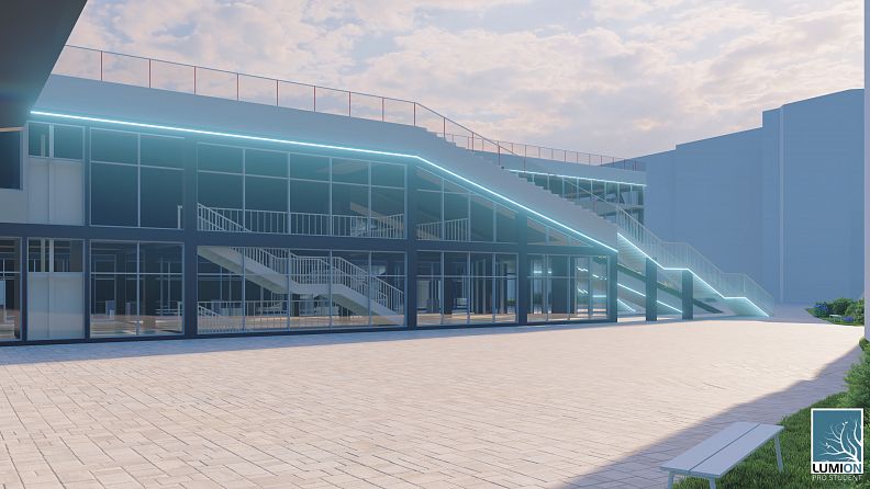
The green roof was chosen, in order to create as much open space for students and teachers as possible, accessible for spending free time together, creating a core of the STU community. This type of roof is ecological and aesthetic, which maintains an optimal thermal regime: cool in summer and better thermal insulation in winter, compared to other types of terraced roofs. Access to the roof is ensured by 2 stairs on block B and exits from the stairwell of each block. Slope crossings between blocks or between the levels of the same block on the roof can be lower than ½.
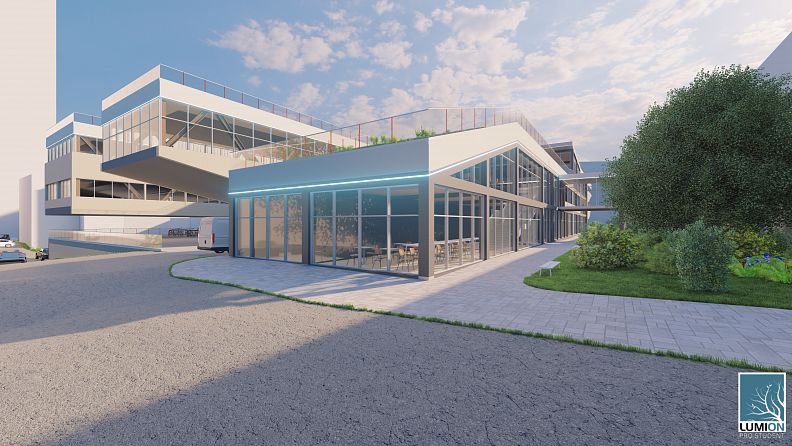
In the western part of the site there is designed an amphitheater, with a pavilion opposite to it. Therefore, it will be possible to organize outdoor events here, and the pavilion will allow participants to have a shelter in case of rain.
According to the requirements of the competition, we connected the newly designed building with the existing faculties through a walkway, which passes over the main entrance to the building. The first thing any visitor notices when entering the lobby of the new building is a corridor 12 meters wide and 54 meters long, equipped with work tables and sofas, so that students can rest or study during breaks and free time. To facilitate the orientation of visitors in the building, the floors are marked with different colors the access roads to multiple areas of the building, each area being assigned a separate color.
Technical information
The color used for the exterior walls is och, the reinforced concrete construction system on the surface of the facade is painted in dark gray, as are the walls under the console. The metal beams are not colored.
The bearing structure represents a symbiosis between metal construction and reinforced concrete. The middle part of the building is made of reinforced concrete, which is less expensive and easier to install than the metal construction systems. Two types of beams are used, one with a distance between columns of 6 meters, another with a distance of 9 meters, located in the stairwells and between blocks. The consoles at the ends of the blocks are supported by a system of metal beams placed as braces. The project inspiration, which was a worthy example to follow is Villa Mediteranee, in Marseille, France, where there was built a console with dimensions similar to the proposed design, with the same distance between the main supporting elements (12 m) and an akin console length. The configuration of the metal beams, their pitch and the finishing construction material of these consoles were inspired by the Villa Mediteranee.
