Train station Havlíčkův Brod

Project idea
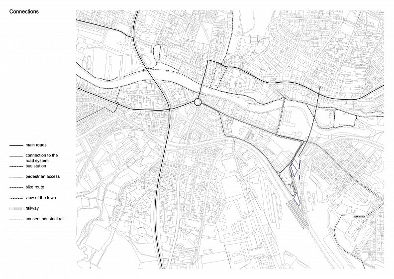
Train stations are a problem of many Czech cities as they often are excluded from their surroundings. The situation in Havlíčkův Brod isn’t any different, moreover, because of a high-speed rails planned to go nearby, this particular station will need to be able to transport even more people in the future.
Project description
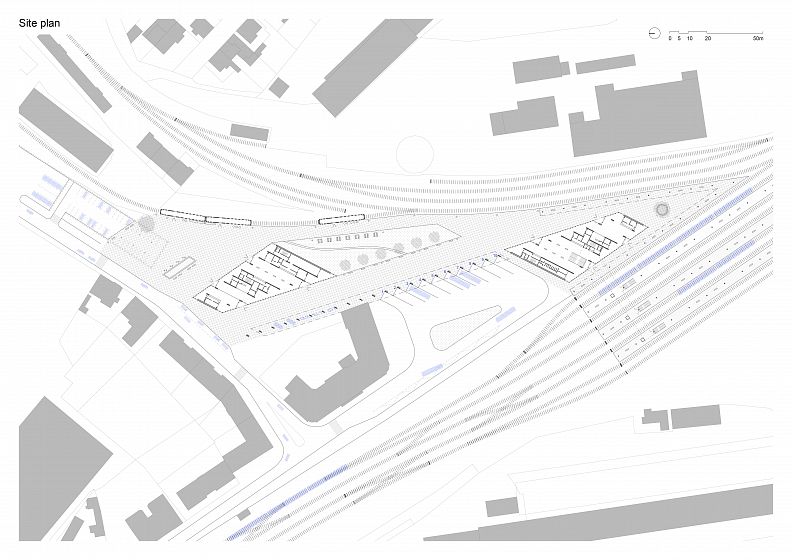
The goal of this project was to design a train station that becomes a relevant part of the built structure, connects the means of transportation with the town and acts as its dignified entrance gate. The relationship between static town and moving transportation is visible throughout the space itself as well as the design, two buildings define two public spaces, give them direction and character.
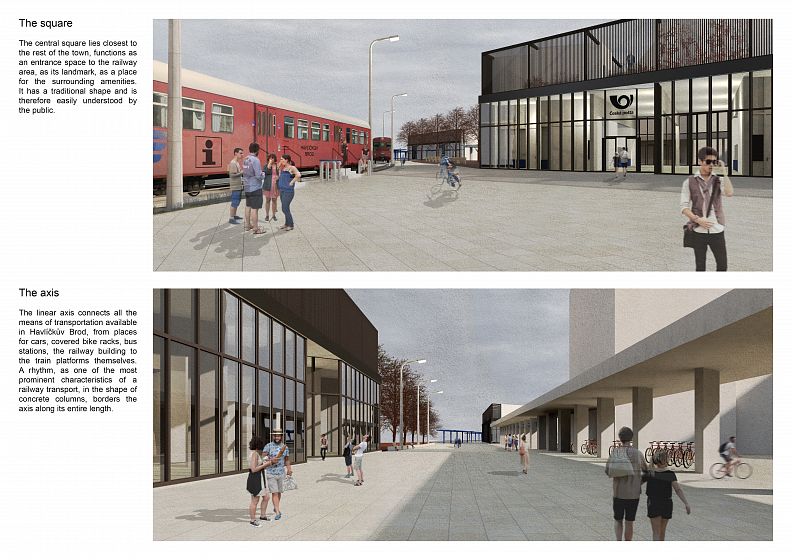
The central square lies closest to the rest of the town, functions as an entrance space to the railway area, as its landmark, as a place for the surrounding amenities. It has a traditional shape and is therefore easily understood by the public.
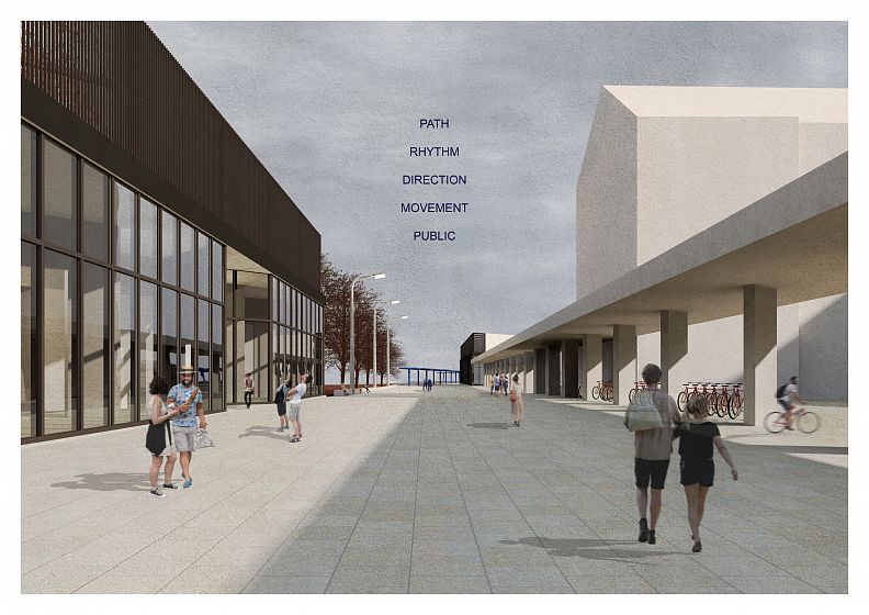
The linear axis connects all the means of transportation available in Havlíčkův Brod, from places for cars, covered bike racks, bus stations, the railway building to the train platforms themselves. A rhythm, as one of the most prominent characteristics of a railway transport, in the shape of concrete columns borders the axis along its entire length.
At the ends the concrete rhythm transforms from the exterior to the interior load bearing structure of both buildings – one being the railway station itself, the other a post office with a shopping area. They are the same in their volumes, keep a solid shape in order to unite the whole fragmented railway area in one. They are placed in the direction of the most natural movement through the area in the aim to lead a visitor through with clarity and certainty.
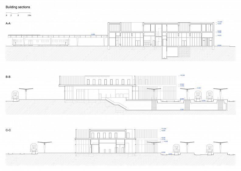
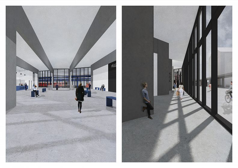
The long facades facing the two main public spaces are as transparent as possible, the short ones on the other hand look rather massive to keep the buildings at their place. On the inside the spaces are divided by the rhythm of the load bearing structure. The free modules make up the public halls, the occupied volumes house the needed service spaces such as the ticket or post office desks, public toilets, etc.
The public halls aim to be as clean and clear as possible without any distractions in the shape of confusing signs or number of lockers, machines, and dark corners. The orientation system is therefore a part of the load bearing structure as it is visible enough and tells the visitor what lies in the next volume. The part of each occupied volume that face the hallways are on the other hand as occupied as possible to avoid the creation of empty hidden spaces. They contain the lockers, vending machines, ATMs, entrances for employees, to public toilets, utility rooms, windows to bring natural light to the offices and even spaces reserved for advertisement.
The second floor protrudes above the roof only in some of the modules, the remaining spaces are accessible for the employees as a terrace and a garden. Both buildings are lower than some of the closest neighbours due to their public function, the solid boxes of the offices, paved spaces with the movement of employees and quite large green spaces create a roof landscape that allows the buildings to communicate with their surroundings even above ground.
Technical information
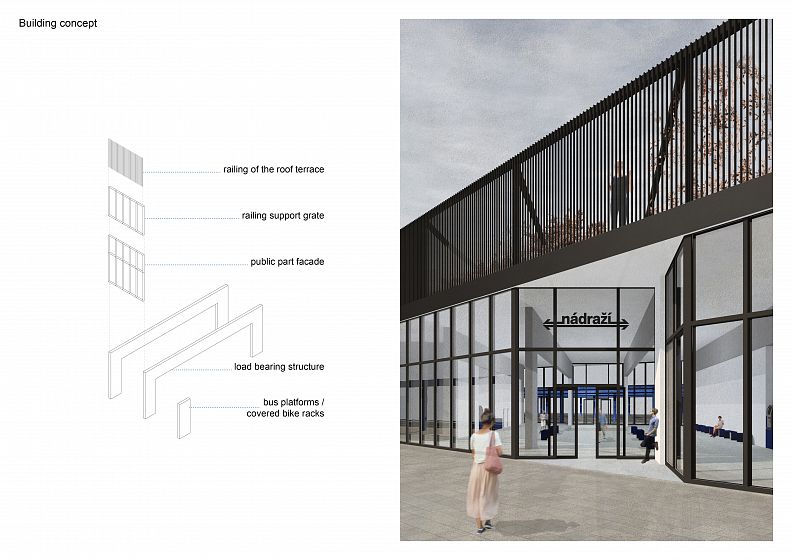
The load bearing structure is made of concrete as it highlights the direction of the whole train station area. It connects the public interior and exterior by allowing the same rhythm and dimensions to work as frames on the inside and single columns of the platforms on the outside. Quite large portion of the roof functions as a terrace and a garden for the offices on the second floor and is all around surrounded by a steel structure. This support grate holds the railing which provides a necessary privacy, shade and also gives the building a compact shape.
The structure is left visible in order to highlight the direction and to understand how the building is organized. People move through them from from one public space to the other, from the town to transportation.
