Market Reconstruction in Derbent (Dagestan)

Project idea
project author: Shchegoleva Polina Vadimovna
project manager: Kuzmenko Alexander Nikolaevich
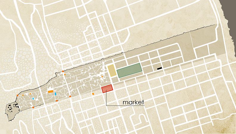
First of all, I need to say a few words about the city. Derbent is a city with a rich history on the shores of the Caspian Sea. Being in the possession of the Persians, Arabs, Khazars, Soviet power, it absorbed many cultures and traditions. Also, for several centuries the city was an important trading point. Over time, the trade center changed its location. Today, apart from shopping malls and small street trade, there are 5 operating markets in the city. And the main attraction of the city is the citadel and two fortress walls going from it to the sea.
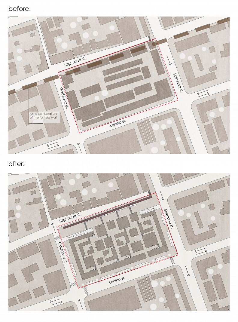
The city was concentrated between these walls for many centuries, so all the most important tourist places are located there - the main mosque of the city, the ancient gate, the park and, which became the symbol of the new city in the 20th century, the Freedom Square. It is here, on the border of the old and the new city, that the design site is located. The market appeared here at the end of the 19th century and remains to this day. Before the market appeared, the southern fortress wall passed through the design site, now the foundation may remain.
The site is complicated by the relief. The height difference between the neighboring streets is 5 meters. If earlier the market consisted of wooden trade shops, now there are shops scattered around the perimeter of the quarter, and in the center, there are open shopping arcades. The area of the site is slightly more than a hectare. Car traffic to the right and left of the site is one-way, and there is a dead end on Tagi-Zade Street due to the relief.
First of all, the decision was influenced by the layout of the old eastern city. Intricate narrow streets lead you to spontaneously organized squares where an event unfolds. This is how the old city, adjacent to the site, is arranged. It also resembles a bright national Dagestan carpet - a riot of colors and patterns.
The same motives influenced the work on the facade and canopy. In addition to embroidery and architectural ornaments, the laying of ancient stone walls is itself an airtight pattern.
Thus, several principles of further design were derived: this is a labyrinth as an unusual and interesting spatial experience, intuitive for residents, transparency as openness and hospitality, an invitation to a given market space and politeness as a reverent attitude towards the existing development due to the burden of historical heritage.
Project description
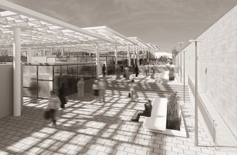
The starting point for the design was the restoration of the so-called "wall". First, to correct the relief, secondly, to separate the market area from the private sector area and the roadway from the side of Tagi-Zade Street, i.e., to create a comfortable environment for both residents of private houses and market visitors. Thirdly, the creation of a public space around a place that refers to the history of the city - a pedestrian boulevard along the restored fortress wall.
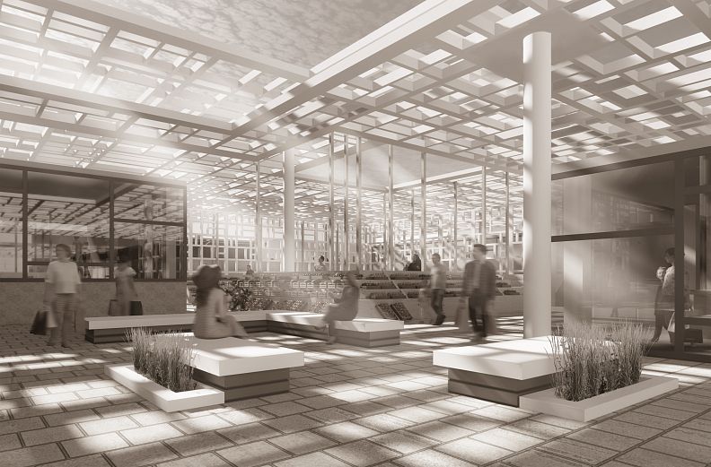
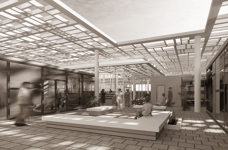
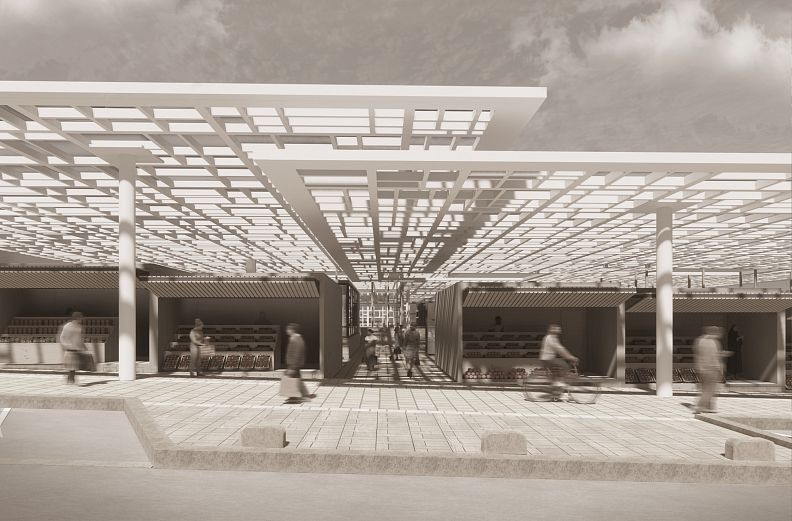
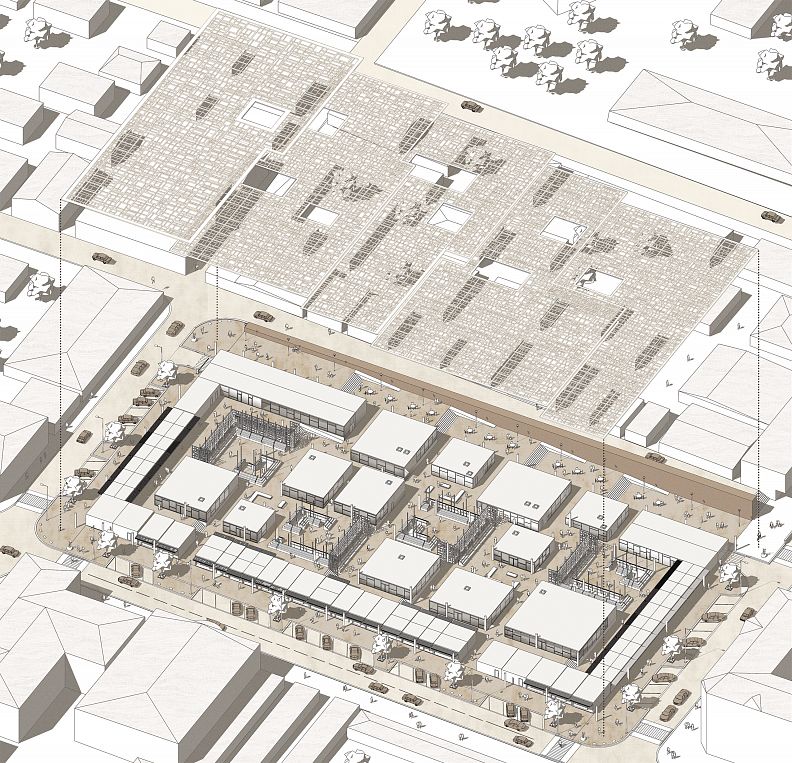
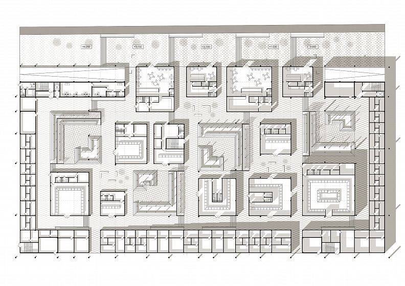
Two entrances to the market are located from the main street of Lenin and from the side of the wall. The market is located at five levels. Elevation changes are organized using stairs and ramps. Inside the market, we move through a labyrinth of trade pavilions of different sizes that create small spaces. Derbent is also a rather hot city, so it was decided to design sheds - also five, above each level. A small geometric pattern creates a play of light and shadow on the glass of the pavilions and on the paving.
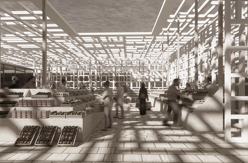
To solve the problem of a large number of cars and obstructed traffic two-level underground parking for 250 cars was designed. The entrance to it is carried out from Gadziev street, and the exit from Salmana Street. Thus, a large parking lot appears for all residents and employees of the city center. Spontaneous parking on the streets is unloaded, and an additional passage is created along Tagi-Zade street. There are also warehouses and bathrooms for visitors. On the market itself, there are both closed glass pavilions of fish, meat, milk, and others.
So are open pavilions for vegetables and fruits. Continuing the theme of the closed eastern city and walls, “walls” also appeared along the perimeter of the market, but they also function as small open shops, both on the street and inside the market. There are cafes opposite the wall; in good weather, the squares can serve as a continuation of these establishments. This is what the final plan looks like. On the right, there is a descent into the parking lot and to the bathrooms. On the left is the descent into warehouses and premises for market workers, from where the goods are loaded there are also three escape stairs, small administrative block and a security post.
Gated pavilions are the main trade area with counters for visitors and a separate area for employees with their own entrance and utility rooms. Open-type pavilions are an area around which open shopping arcades are formed. The shops along the perimeter of the market have a small utility room and a main retail space. At night, the object is closed, and during the day the door becomes a canopy.
A very important aspect of the perception of the architectural appearance of the eastern city is that, in contrast to the western tradition, the artistically designed facades face the courtyard. The facades of the pavilions are restrained, made of glass. The main pattern is the play of light and shadow, and in the main, it is people and goods that will bring colors, movement, life to it.
Technical information
Site area - 1.10 hectares;
Number of storeys - 3;
The area of the underground parking - 0.95 hectares;
The number of underground parking spaces - 250 m / m;
Building area - 0.75 hectares;
The total area of the building is 1.70 hectares;
Building volume - 67500 m³;
Number of jobs - 230;
The area of retail premises - 0.35 hectares;
Landscaping area - 10 m².
