Multifunctional Building + Market (Janet)

Project idea
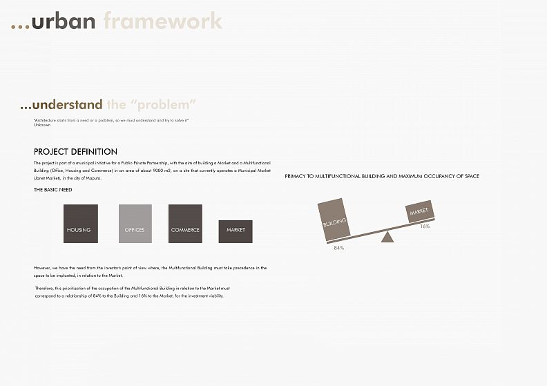
The project is part of a municipal initiative for a Public-Private Partnership, with the aim of building a Market and a Multifunctional Building (Office, Housing and Commerce) in an area of about 9000 m2, on a site that currently operates a Municipal Market (Janet Market), in the city of Maputo.
However, in this partnership the municipality is required to integrate a market, and the private investor requires that the market occupies up to 16% of the total buildable and the Multifunctional Building occupies 84%, so that the investment is viable (and therein lies a large project challenge)
And just for the record, the market had a wide variety of activities that were not part of the legal formation of the market and it should be reintegrated in a functional way. And the context of the city of Maputo is characterized by the problem of public parking, high traffic congestion and lack of living public spaces !.
And in this problem-solving process, the municipal legal requirements for land occupation, construction volume, building spacing, maximum height, and specific legal instruments on building markets, housing, offices, commerce, parking should not be ignored.
Therefore, as students we were challenged to find solutions to this complex combination during the semester.
Project description
REVIEW SUMMARY
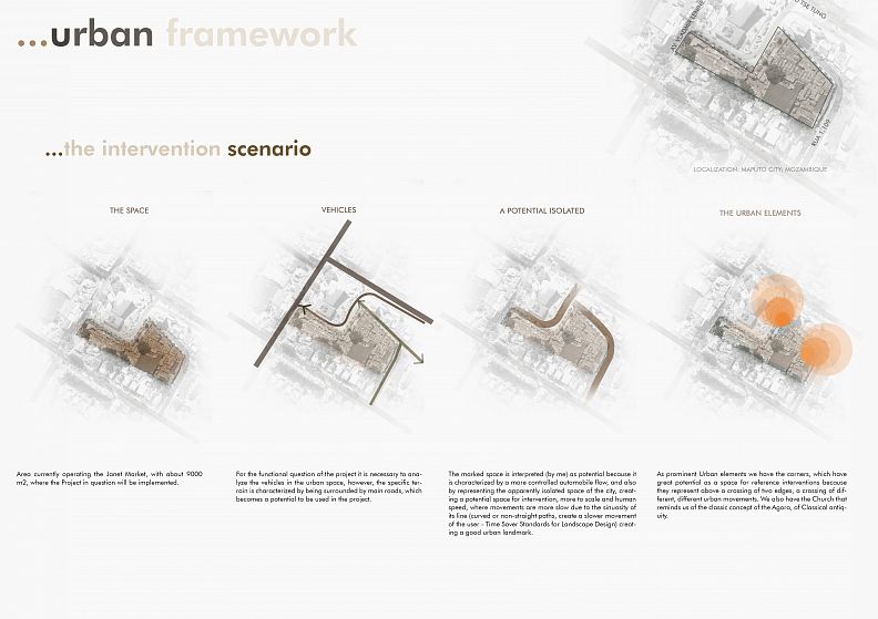
Facing the challenges of the project, an analysis of the space was made, of its surroundings, thus removing relevant data for the project, such as the existing streets, the direction of traffic, the dimension of the sidewalks, the height of buildings around their functions, and the diverse urban elements that can be highlighted. And in view of these data, the existence of a church that is an urban landmark in front of the land and the “isolated from the land” character was highlighted for having along its perimeter secondary streets and not avenues that are high traffic roads, and these streets translate a slower pedestrian traffic that is of great importance for the public space, and due to the geometry of the terrain there are 3 corners that have great urban potential to be addressed, as they represent a crossroads of different movements and a meeting point.
And we proceeded with an internal analysis of the activities in order to quantify and redefine them, studying the models and the ways of selling. To better establish a proposal that is more realistic and makes better use of space.
VISION
Therefore, this group of analyzes made during the study of the area, a new approach was established, where the problem not only resided in the internal complexity of the program, but in the urban integration of the whole, analyzing the context it is perceived that by its volume it does bring a impact on the urban landscape and that the intervention goes beyond the pragmatic response to a program but touches the much larger sphere, the sphere of the city, this modifies the scenario where it is integrated and there arises a more human approach, an urban approach that serves a purpose bigger, society. Therefore, the building's urbanity becomes an important variable for the project.
And this approach appears as an opportunity for the project in a context in which the public space is little worked, where the urban landscape is poorly overlooked, cities are not seen by people. And supporting the program itself, we have the market that makes the idea of the building's urban relationship irrefutable.
So, the building starts to serve not an individual but a collective purpose, and without affecting its basic need, which is the program.
Therefore, it can be said that the project is no longer a “mass” in this space, and becomes an object that brings with it measures to enhance the city's space, however it responds to the defined basic need, in a balanced and proportional way.
And this intervention gives light to a differentiated space in the city, a space that carries with it several peculiarities that clearly responds to the contemporary cry for living spaces in Maputo, a space that is unique to that area because in an organic way it fits in space and takes advantage of existing elements to enrich the space. A space where the urban landscape can be experienced (not a landscape in the sense of green, but in the sense of a true urban landscape, to which people adapt) an inclusive space that through its gestures makes social integration.
And this intervention mirrors urban acupuncture, which transforms your space and its surroundings. A small operation that makes a difference and presents an alternative for transforming the city of Maputo through a new approach, which paradoxically is quite old.
STRATEGY
Therefore, as a direct strategy to respond to the challenges contacted in the project, along with its primary requirement, which is the program and the investor's requirement. The proposal construction process was divided into 3 scales: the Urban scale that serves the building and the public space, the Program scale that responds to the relationship between the main spaces and a more specific scale that addresses the peculiar requirements of each function. However, this scale variation is subtle, being linked to what brings greater cohesion and the building. And each operation is intrinsically connected to another.
THE BUILDING IN SPACE
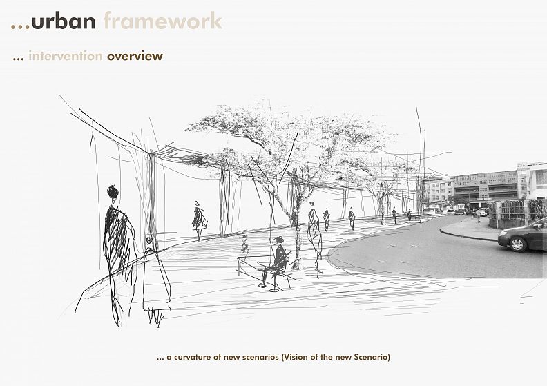
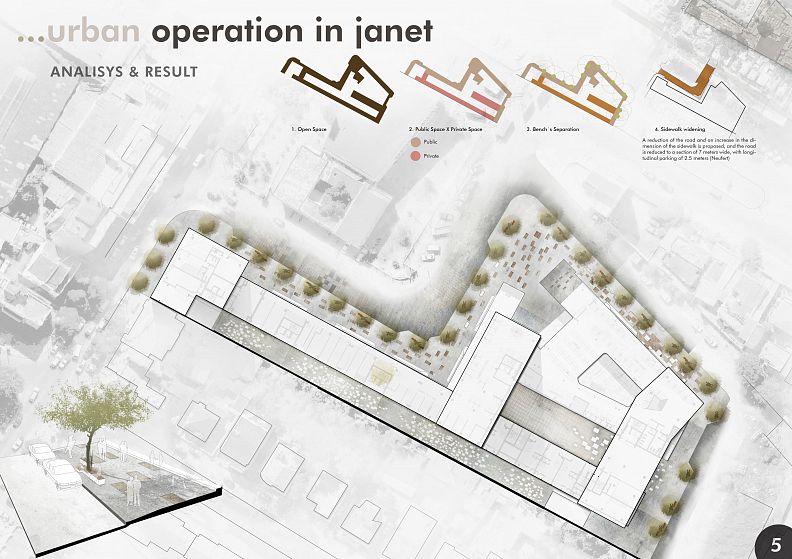
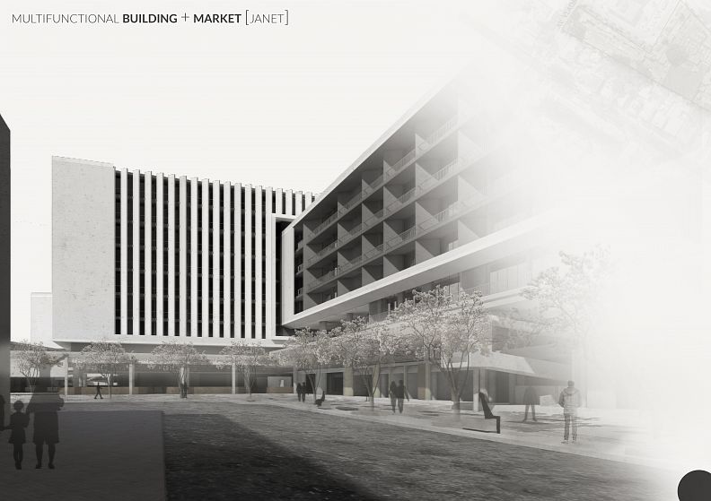
For an urban scale, the intervention works in the peripheral public space, taking advantage of the sidewalk and the street to create an ideal scenario for the development of the public space, using the widening of the sidewalk in an operation linked to the manipulation of the shape of the building through subtraction of its “mass”, thus increasing the collective scale in the dimension of the walk, and to emphasize the identity of the public space, arrangements are used that make it more lively and enjoyable for appreciation, ceasing to be a place of passage, these arrangements are made through color and texture variation on the floor, which stimulates the user, and by the presence of benches that are strategically placed to accommodate a more static situation of the use of public space. We have the implantation of trees that provide shade and enrich the scenery creating greater comfort and diversity, and remember that we are facing a tropical climate, and the species of trees chosen are the Acácias for being part of the history of the city of Maputo that is known also as a city of acacias.
The benches are repeated modularly over a distance of 20 meters (and accompanied by afforestation) to enhance the relationship between people, because at this distance it is possible to perceive facial expressions (Jan Gehl) without being invasive, and the fact of being able to observe people it is one of the reasons that takes us to a public space, as Man is attracted to Man.
Therefore, to emphasize this approach in relation to the public space through the manipulation of the building.
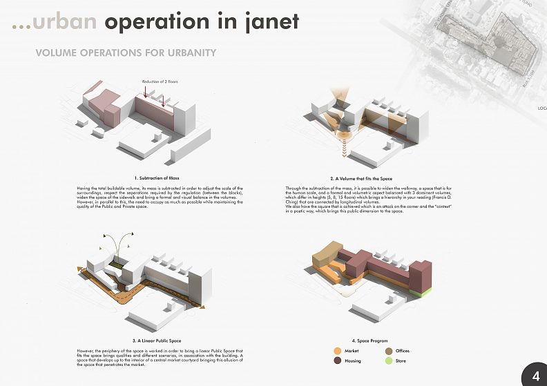
As mentioned in relation to the total buildable volume, the mass is subtracted from it in order to form a building that fits the urban scene and expresses its urbanity and the scale of its surroundings. Giving space for the widening of the walk. This subtraction is done to also respect the regulations for the separation of buildings.
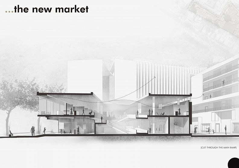
The manipulation of the volume made it possible to find a balanced form for the city and for itself that functionally accommodates activities, and taking advantage of the linear characteristic of the public space, it was established that the market would be linear that accompanies the urban movement making this mediation in the transition and direct relationship of the building with the city. And in this relationship between public space and the market, there is a square facing the main access of the market, on the corner that makes the poetic relationship between the market courtyard and the church, reminding us of the democratic space of classical antiquity, marked by the Roman agora, which emphasizes the meaning of that space.
(The building's other functions are developed along the other floors) and the resulting form of this operation is dynamic, presenting a hierarchy of volumes that reflect the balance in itself. Thus, having the functional balance and urbanity of the building.
A pertinent question, which is raised by Jane Jacobs, is the clear separation between public and private space, which results from the reduction of conflicts, however, the building itself proposes a clear and unmistakable separation between public and private space. particularly at the level of access.
Therefore, this combination of factors resulting from singular operations creates a peculiar image of the public space, the “image of the city”, alteration and enrichment of its landscape where each element that composes it can be appreciated without coming into conflict with the other, but at otherwise, working in synergy. A space where all types of activities are developed, optional, leisure and necessary, a space that accommodates fast and slow movement, a dynamic and static space. A space to contemplate, sit, cross and talk in it. A LIVING SPACE IN THE MAPUTO CITY !!
THE FORMAL COMPOSITION OF THE BUILDING
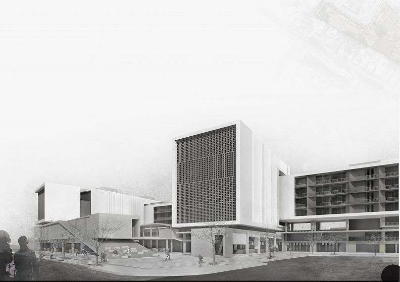
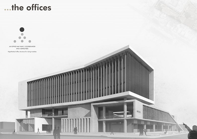
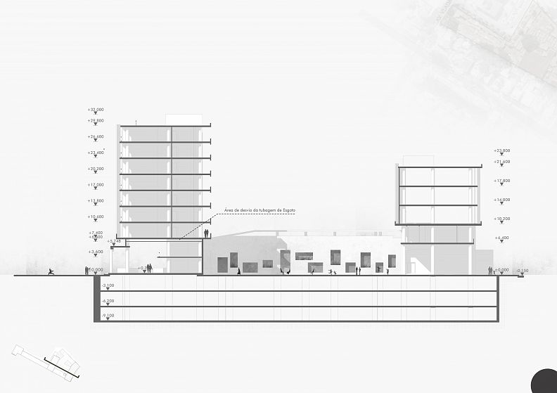
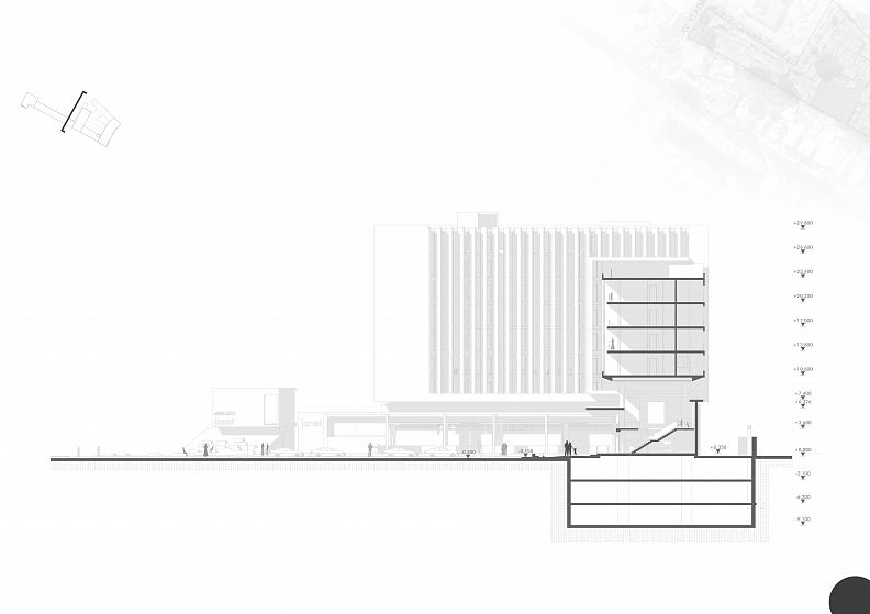
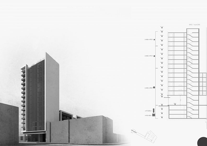
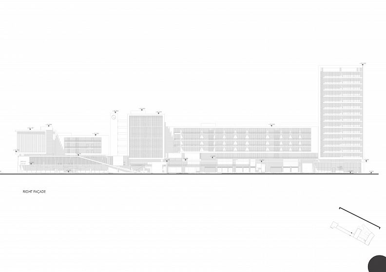
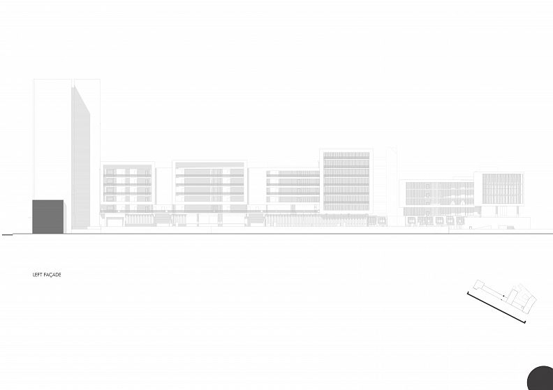
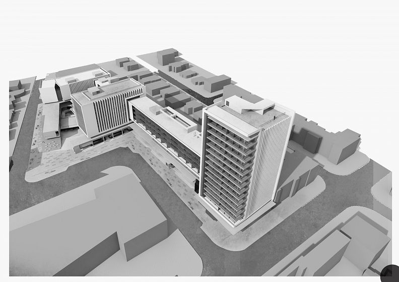
The formal composition of the building and made using as the basis of the Market that is made with stands out for the neutral colors in the gray tone of the exposed concrete, which brings an apparent rigidity on the first and second floors, and subtly on this “brutalist” linear volume we have the volume that houses and offices develop, which corresponds to 3 hierarchical volumes of 3, 7 and 15 floors connected by longitudinal volumes, where these are delicately separated from the base by a horizontal strip giving a feeling of levitation of the volume and for complete this separation the upper volume the upper volume has a white and dark gray finish, thus having a formal contrast, but which is nevertheless aesthetically complementary. The meeting between the longitudinal and the main volumes is done through the mediation of an “apparent hole” that gives the impression of penetration or of one volume arising from the other.
And the result of this functional distribution allowed the great leap to be made to comply with the investor's requirements.
THE MARKET
The Janet Market is designed taking into account the following principles:
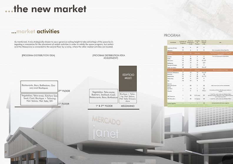
URBAN FRAMEWORK, where it is made so that it fits perfectly to its surroundings through its lightness and openness scale; LINEARITY, where it is done as linearly as possible so that it fits different consumers, giving the product “chance” the ease of reading your product, developing along the ground and opening up to all sides in order to bring this Urban dynamics and all its periphery; QUALITY OF SPACE, where your space is not just an “emptiness or cavity in the dough” (Zevi) but a space that brings qualities to the human dimension and the development of scenarios that bring qualities to space, an organic space; CAPITALIZATION OF SPACE, for questions of investment viability being adopted a Mezzanine to capitalize this Use of space; ENVIRONMENTAL PERFORMANCE, where it adjusts to the climatic context, taking advantage of ventilation and natural lighting, this by creating a patio that facilitates the ventilation and distribution of light, however being careful with the issue of sun protection; SOCIAL DIMENSION, where through its morphology and mainly its patio brings contact with the outside and consequent visual contact with people and different activities.
The Market has accesses made by ramps for disabled people strategically placed to allow access and throughout its space and allow faster evacuation at both ends of the market, the same happens with the stairs.
We can state in an informal (perhaps poetic) way that, The Janet market is where we feel the wind passing through space, due to the valorization of natural ventilation, it is what opens up to its surroundings, it is what does not confine people (like the supermarkets), however it is liberating through its transparency and its opening to the outside, where at any point the user has contact with the outside (increasing security in space) is where interpersonal relationships and contacts are valued, where through their openness there is the possibility of seeing people abroad (man is the greatest joy of man- Gehl) bringing that social dimension of man (it is scientifically proven that seeing and enjoying people is a great attraction of public space, Jan Gehl- Cidade for people), natural lighting is valued at all points of the market, the market space is designed to maximize its occupation, however the circulation factor and its scale are seen, where its dimension is valued o and scale in order to avoid saturation of space prevents it from being read as an element of the city (Kevin Lynch, The Image of the City), its circulation space is not “mechanically” retained by the 30% concept, however it manifests itself organic adapting to the movement, trying to have dimensions that minimally facilitate the movement of people, and activities in the market.
DISTRIBUTION OF ACTIVITIES
For the distribution, 3 factors were taken into account, Length of Stay in the Activity (for the Vertical layout of the Activities), Relationship with other activities or Convenience of Proximity (for your grouping).
As for the proximity to the street, the Take-away's closest to the street were placed in order to make the street and the space more dynamic, since restoration activities are the ones that most people move in a space (Time Saver Standards for Landscape Design)
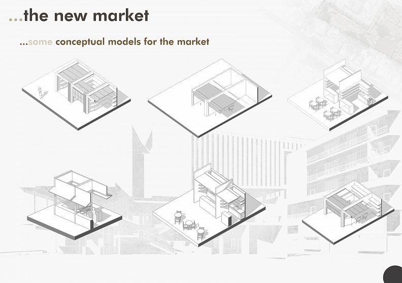
The point of sale models were redesigned to accommodate the new space and capitalize.
The market was made to be filled by users and gain a peculiar and personalized image, to give space to varied coloring, highlighting each point of sale, and its image may vary over time.
OFFICES
The offices are in a single volume and segregated in a purposeful way, so that there was a highlight in its volume valuing its image and identity.
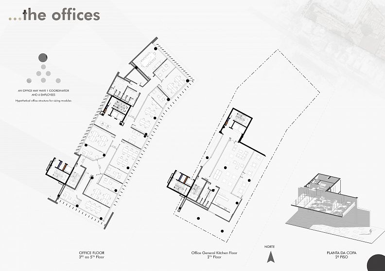
The office has a main axis that distributes to all modules and that connects with the two existing vertical accesses (and these were placed in order to satisfy the requirement that the recommended route from the different points to the circulation nucleus must 30 meters) and the corridor has a minimum width of 2.0 meters, respecting what is required by the Posture (gallery cases with access from both sides, the corridor must be 2.0 meters)
The pantry is unique for all offices and it is designed to bring a moment of contact with the outside, a moment of socialization and fun on the part of the user.
The Sun Protection devices are fixed and on the façade closest to the North, the sunshades have a different orientation to ensure greater efficiency in the critical period of the day (This orientation is also done to mitigate the fact that the recommended ones are horizontal, however not adopted for the sake of building composition and language)
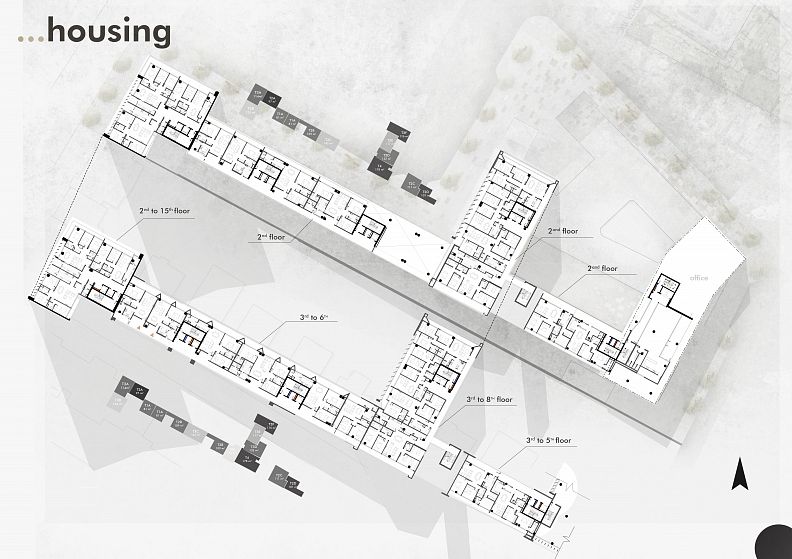
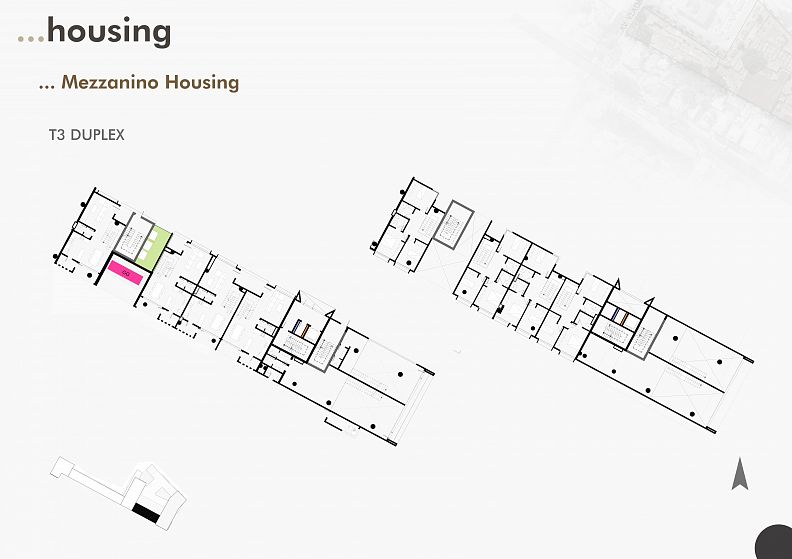
HOUSING
As a way to qualify the housing space, conditions are created that privilege the same, such as the privatization of the common space, with a clear segregation with the public and semi-public space, common patios are created that accompany the building's entrance bringing a good experience under from the user's point of view, however, the arrival at the home is no longer rigid, and becomes smooth through the intermediation of common spaces properly treated
And for the interior of the apartments, the principles of spatial organization of the rooms, the kitchen and the toilet were observed, for greater capitalization of the space, common spaces were chosen so that there would be greater amplitudes and the service area with its own access was not excluded, as required by the municipal regulation.
FACADES
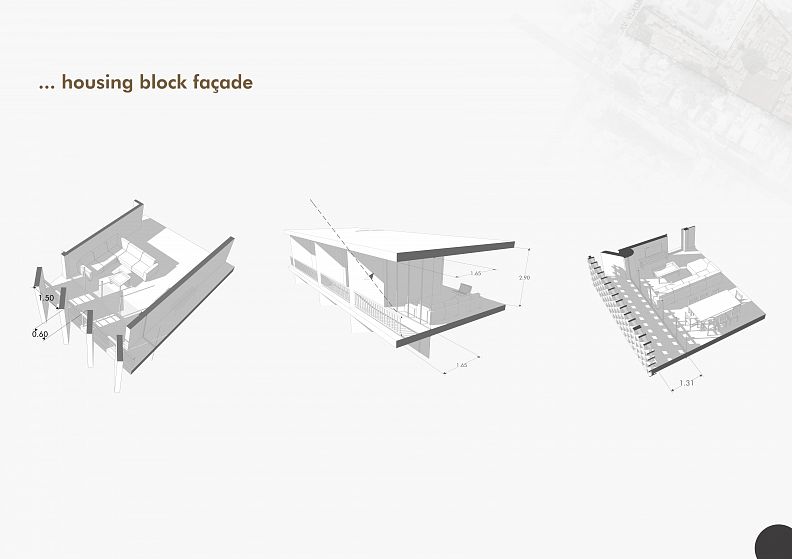
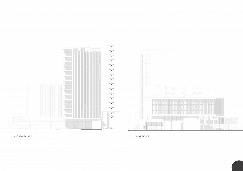
The facades were designed taking into account two factors deemed fundamental: FUNCTIONALITY (sun protection and natural ventilation) and IMAGE (the formal aspect of the building) For façades facing East and West, vertical sunshades were placed to allow this sun protection, and this they were designed to bring a composition of rhythm and repetition, and to prevent their placement from bringing a very dense appearance to the facade. For the façades to the north, the projections of the balconies are used to use as sun protection, and also the square grids for a specific situation, where the geometry of the grids is in agreement with the geometry of the facade.
The rear façade also received formal care as it somehow faces a part of the city.
The tallest block of the complex was treated in such a way as to emphasize its verticality by means of vertical sunshades along its west façade, which faces an avenue of great importance where there are few tall buildings, and thus figure as a Landmark. And these vertical sunshades have a continuity until exceeding the cover height without being interrupted to bring that impression of infinity.
TECHNICAL QUESTIONS
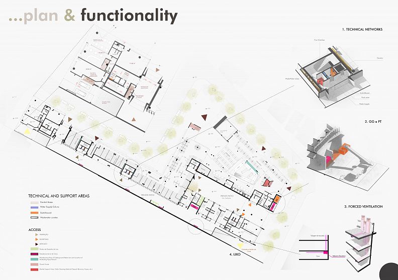
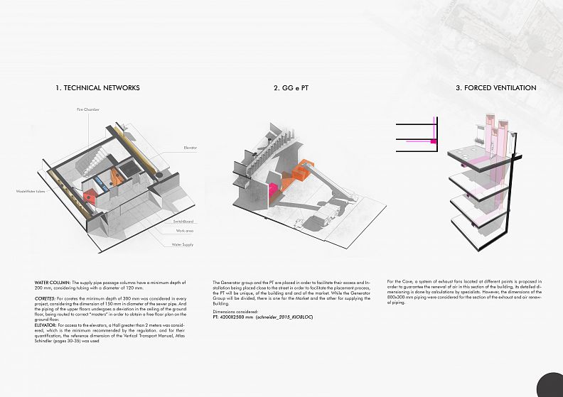
The technical areas were arranged in order to facilitate their installation and maintenance and the forced ventilation system for the basement, made by exhaust fans. And the networks are integrated into the stairwells and elevators that are constant along the floors of the building, which facilitates distribution. And the sewer system is in the basement next to the underground parking.
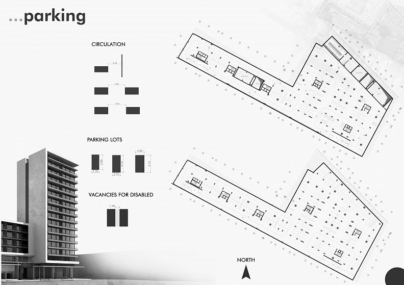
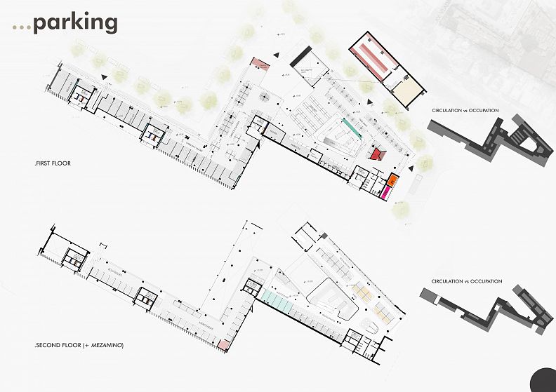
Parking is done over 3 underground floors with a total capacity of 419 cars distributed proportionally to the needs of each function.
The elevators have the capacity for 8 people, and the stairs in turn were dimensioned as required by the stairs regulation for each function, such as the minimum depth of 1.5 meters for collective dwellings
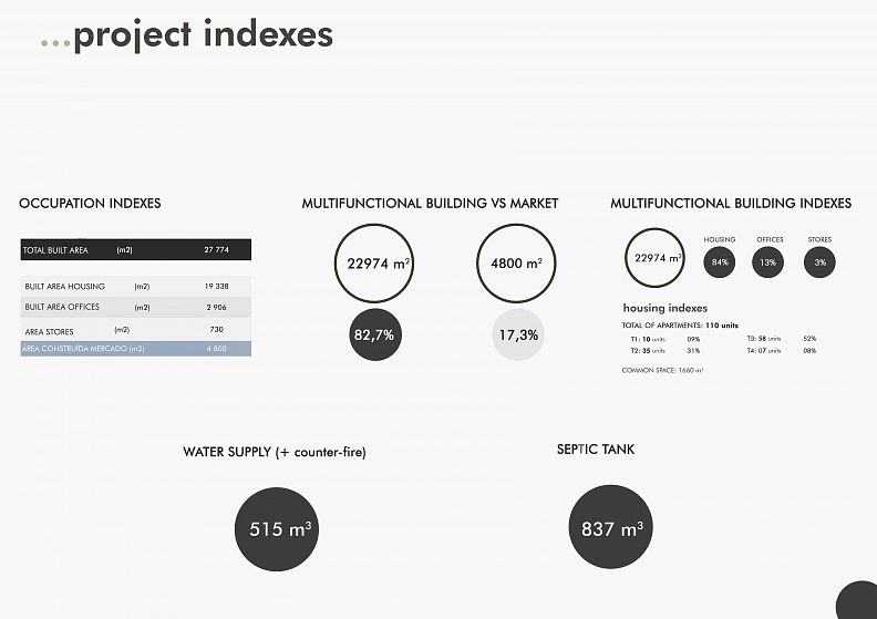
* Technical data about the technical installations and their quantification will be found in the images, and the data about the parking.
##
With this whole process we can say that architecture always responds to a greater purpose than the need to complete certain established numbers, in addition to solving in a “pragmatic” way what the program establishes. It responds to people it responds to the city, it responds to day-to-day life, it responds to the complex needs of human beings and nature, be they known to the unknowns that are discovered throughout the process of their development. Architecture is a field of discovery!
FINAL DATA
MULTIFUNCTIONAL BUILDING: 82.7%
MARKET: 17.3%
* Detailed data can be found throughout the documents to be sent
Technical information
- The Master Plan and Mobility of Transpores, by Metropolitan Transport Agency (AMT)
- Technical details made by the author [Reference: francis D. K. Ching-Building Construction Illustrated-Wiley (2014); Neufert: The Art of Designing in Architecture (1976), and other manuals]
- Elevators; Vertical Transport Manual in Buildings - (Schindler)
- RGEU (General Regulation of Urban Buildings)
- Posture on the Constructions and Buildings of the Municipality of Maputo [Municipality of Maputo]; Clearances, Housing, Offices and Parking.
- Electric Generators: MINAS GERADORAS, GG Catalog
- Transformation Post (PT): KIOBLOC 2015, Schneider

