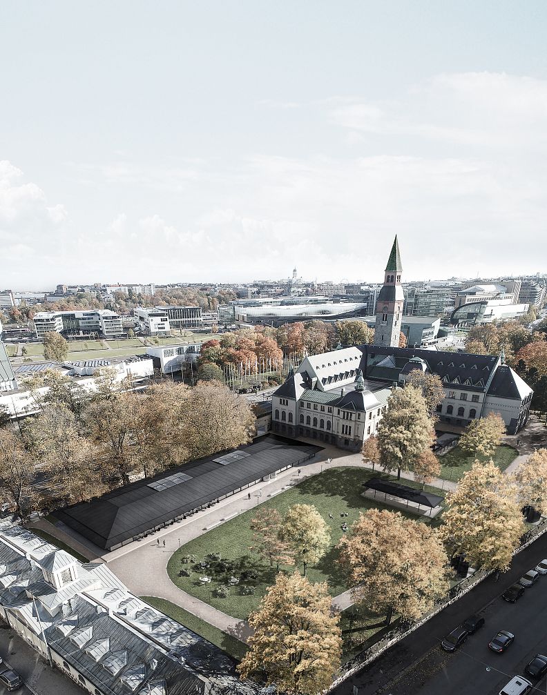
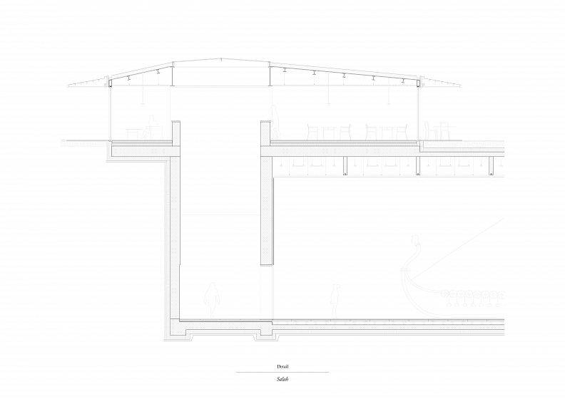
"Salah" - Design of an extension to the National Museum of Finland in Helsinki.

Project idea
Sala- (prefix for secret in Finnish) aims to generate an autonomous spatial identity resulting from the reading of the place, while interpreting the needs of a contemporary museum extension. The developed architecture intends to preserve the aura of the place, highlight the existing qualities and hide a rich and unexpected underworld behind a quiet Pavilion.
Thus, Salah cultivates and celebrates the secret of Helsinki.
Project description
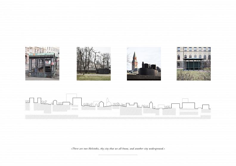
The National Museum in Helsinki, built in 1905 by Gesellius, Lindgren and Saarinen, is considered a symbol of the Finnish identity and is to be expanded in the near future. Over the course of history, the original building constellation has gained in value. The lack of space led to a series of successive projects to extend the museum, none of which, however, came to fruition. These designs progressively drifted from an above-ground to an underground projection, leaving the context as untouched as possible. This running idea of excavation profoundly engages with the deep and hidden Helsinki. The Finnish capital is characterized by an underground master plan, whose invisible network of paths is told by „silent witnesses“, in the form of dark, restrained steel architecture, unexpectedly appearing in the cityscape. The tension between the visible and the invisible, between a vertical and a horizontal “secret” world can be sensed unobtrusively.
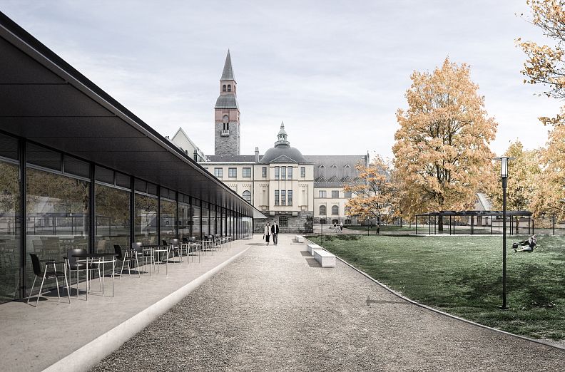
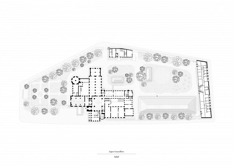
Following the existing logic of sporadic, inevitable manifestations of the hidden underworld, the conceptual intention is to create an architectural link between these two antagonists. The integration of a flat, pavilion-like architecture matches the atmosphere of the park and reconnects with several temporary structures built and deconstructed throughout history. The generated expression creates a clear contrast between old and new, bringing in tension and dialogue.
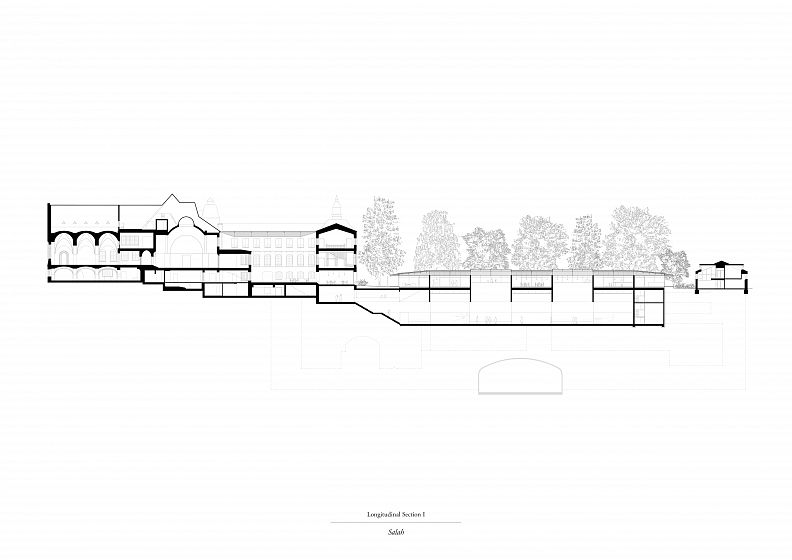
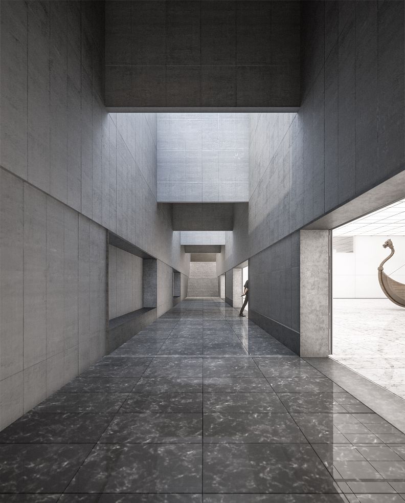
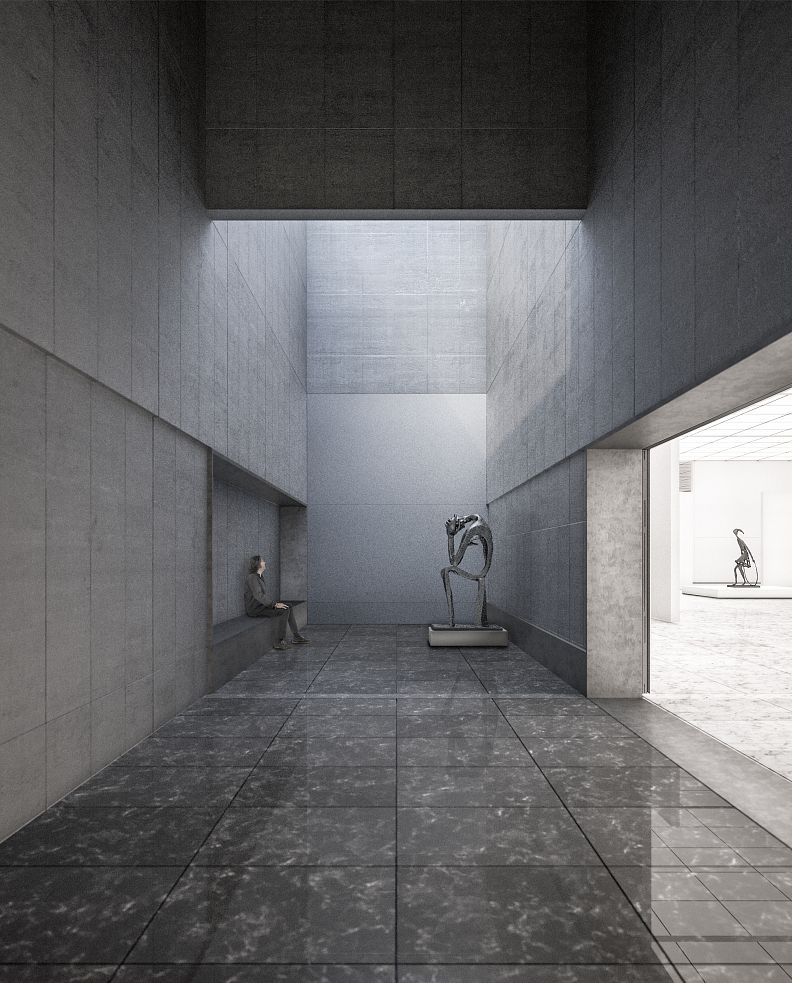
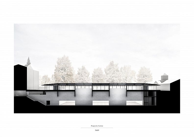
The organization of the project is to be read with regards to the continuity of the National Museum and refers to the existing geometries. The cross-sections illustrate the intention to spatially express the tension between verticality and horizontality. The meeting of these two spatial parameters generates a high corridor, visually connecting above-ground and underground. The structure of the project emphasizes these spatial decisions. It is conceived as a cantilevered metal roof, which lies on concrete veils. This structural backbone dictates and informs the project.
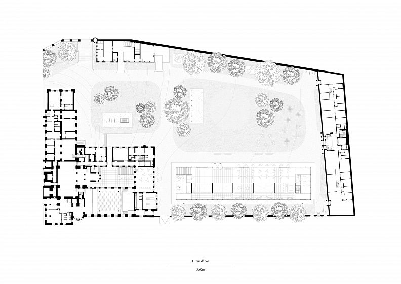
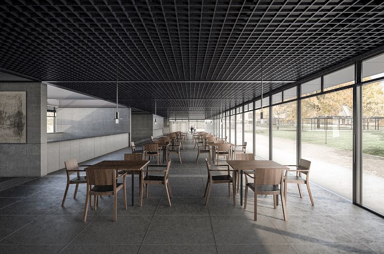
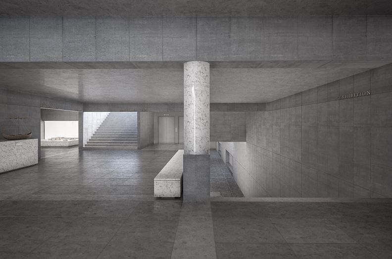
The ground floor houses the restaurant and the entrance area, organized around the structural walls. This level can be emptied, reduced to its bare bones and used as a part of the exhibition. The secondary pavilions can shelter pieces of art as well and thus allow the entire park to be engaged with the design.
This flexibility allows park, ground floor, existing building and underground extension to work as a new and whole entity.
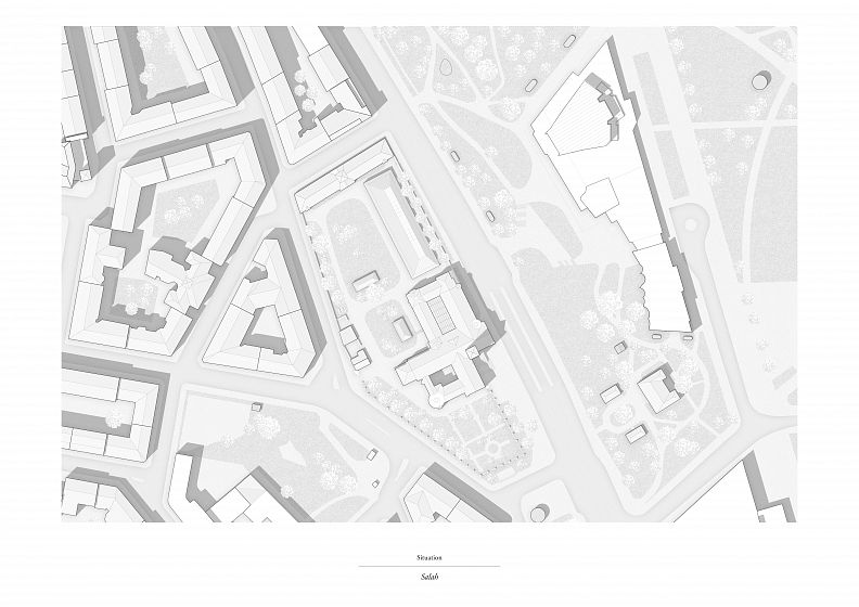
The first basement floor accommodates the shop, the cloakroom and various secondary functions. The built figure of this part of the planned extension (right of the main building) shows geometrical similarities with the already existing basement (above the main building). This serendipitous typological resonance matches the position of the secondary pavilions and thus reinforces the central concept. This gives a voice to an anecdotal precondition.
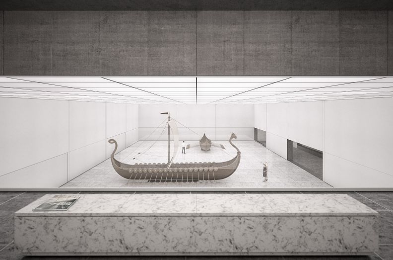
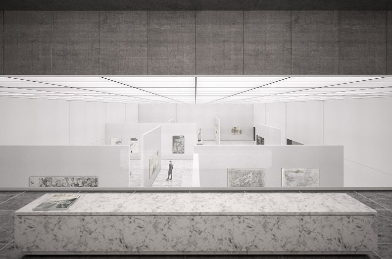
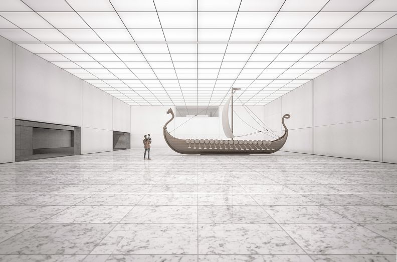
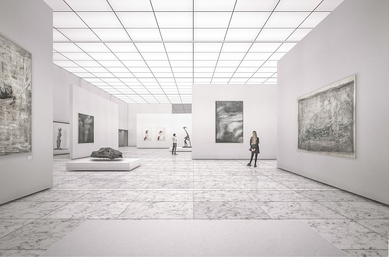
The second basement level leads to the main corridor, which is to be understood as an entrance and part of the exhibition space. The surrounding functions (workshops, warehouse, lift), allow optimal efficiency in the transporting and the processing of exhibited works of art.
The „mise en scène“ of the visitor, a concept born in the “modern” museum, is also a part of the project’s grammar. This architectural ambition is expressed through the openings in ground floor’s slab (between the veils) as well as through the window to the exhibition from the shop.
The high corridor space is the central architectural event of the design. It can be transformed in “cabinet” spaces, giving the chance to highlight an object and add value to the spatial experience. Great care is taken to guide the visitor through the building and to enhance the flexibility of the underground exhibition space. All the details, motifs, rhythms and joints attempt to combine the structural clarity of the project with a variety of uses, which reveal their full potential especially in the interplay between corridor and exhibition space.
The main structure of the project consists of a black metal roof leaning on concrete veils anchored into the ground. This set the rhythm for the entire organization of the project, within which a sequence of open-closed, full-empty and light-dark develops. The structural is ensured by the vertical concrete elements extended into the ground, which allows the ground floor to be reduced to the expression of the main structure.
The triptych “Pavilion (black) – in-between floor and corridor (grey) – exhibition space (white)” develops a chromatic sequence from dark to light. The new building attempts to radically translate the grammar of the existing building – in the form of columns, niches, floor patterns, balconies and pathways.
Technical information
No Master plan. The exercise is an official Finnish competition that took part in 2019. I chose to work on this Theme as a Master Thesis. Details of the whole project + specific exhibition space conditions are developed, as well as the steel structure. Visualizations are produced with Maxwell render. Rules of the competition demands underground exhibition Hall with above-ground Restaurant. Great care is give to relationship with precious existing context.
Co-authors
-
